#vivziepop art critique
Explore tagged Tumblr posts
Text
Some Old Vivziepop art that I actually kinda like and lowkey miss:
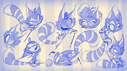


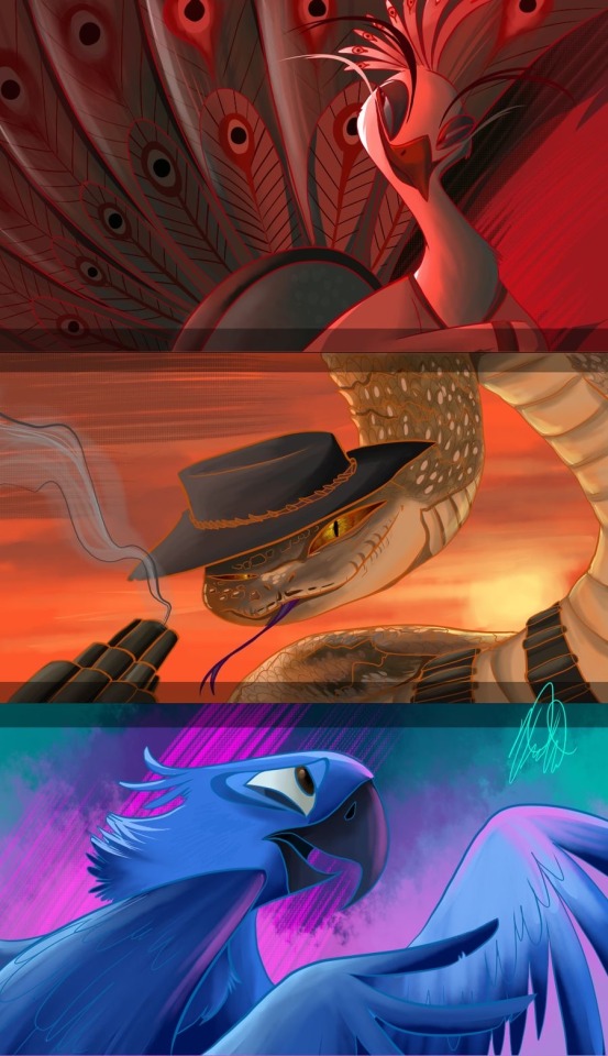


#I feel like her old art was really expressive but now I feel like the only expression she can pull is a toothy grin or angry beedy eyes#her 2015-2016 art was where it peaked the most#it was all still flawed but her art actually had personality and flair to it#now her art is so damn stiff and boring#it seemed like before she was also actually TRYING to do anatomy with shapes and everything but that sure as hell ain’t true now#vivziepop critical#spindlehorse critical#vivziepop art critique
91 notes
·
View notes
Text


I keep saying I wanna get to the seraphim’s but I get bursts of energy to other charactersss!!
Anywho here’s the long awaited Vaggie redesign! I made her outfit similar yo Charlie’s and added gold on her to elude to get angelic identity! She’s also more purple!! I’m so sorry but I can’t stand seeing her in red, it’s just not fitting, her final battle outfit was cool makes me wish she was in that all the time with her hair tied up.
I gave her tufts of fur to bring out her moth look and also because in one of her past designs she had these bright pink fluffy leg warmers so I thought that was cool, I also gave her gold cracks in her skin and made her X’s resemble crosses in her hair.
I wanted to make her look more demonic bit still keep her bright and soft enough to give of that lingering angelic look!
Thoughts on the design?
#hazbin hotel#hazbin#hazbin hotel redesign#hazbin redesign#redesign#vaggie redesign#vaggie#art#sketch art#fanart#digital art#hazbin hotel fandom#hazbin hotel critical#hazbin hotel critique#hazbin hotel art#hazbin art#hazbin vaggie#artists on tumblr#ghostygray#vivziepop critical
2K notes
·
View notes
Text
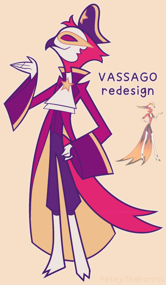
Learning he was supposed to be a pirate ruined me because wtf
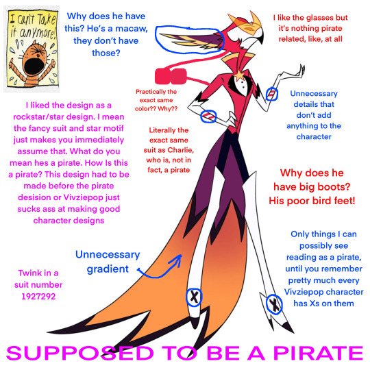
He’s actually one of the better designed characters, which is saying something
#Vivziepop critical#Helluva boss critical#Helluva boss#Vassago#Hazbin Hotel critical#Vivziepop#redesign#myart#character redesign#character design#bird#parrot#design#furry#furry art#art#artwork#procreate#artists on tumblr#Hazbin Hotel#vassago helluva boss#vassago goetia#Fanart#design critique
363 notes
·
View notes
Text


That's a little dramatic but i like it Besides, these problems are serious, such as reproductive violence (force to give birth if you don't want to), loneliness, and high expectations And your husband is also a disgrace to you
#helluva boss#helluva boss fanart#helluva boss stella goetia#stella goetia#stella helluva boss art#stella helluva boss fanart#art#helluva boss vivziepop#hb stella#vivziepop criticism#vivziepop critique#vivziepop critical#anti helluva boss#anti vivziepop#stella helluva boss#hb stella art#hb headcanon#headcannons#headcanon helluva boss
277 notes
·
View notes
Text
Concept: Stella Had Postpartum Depression

It would show some complexity to her character especially again being forced to marry and have a kid at that age. It could be shown as tragic how everything took a toll on Stella that she isn't able to connect with her daughter at birth.
#helluva boss#helluva boss critical#vivziepop critical#vivziepop criticism#vivziepop#helluva boss criticism#anti-vivziepop#helluva boss critique#hazbin hotel#hazbin hotel critical#stella#octavia#twitter#not my art#stella and octavia deserve better#postpartum depression
113 notes
·
View notes
Text
< TW: blood / murder depiction under the cut >

The true ending that should've happened in Sinsmas if Blitz was in character and not being pushed along by Viv and the plot to force himself onto his abuser "lover".
Hope it's of y'all liking lmao and happy Christmas.
#stolitz hater#stolitz critical#anti stolitz#fuck stolas#stolas critical#anti stolas#helluva critical#helluva boss critique#helluva boss criticism#helluva boss critical#anti helluva boss#vivziepop critical#vivziepop criticism#anti vivziepop#fuck vivziepop#my own art#cw murder
133 notes
·
View notes
Text
So hummm, I redesigned Beelzebub again. DON'T get me wrong, I love her original designed and even own a Meow Plush, a standee and pin of her but I do agree with people's criticisms and so, I wanted to take a shot at redesigning her again. So hummm, I redesigned Beelzebub again. DON'T get me wrong, I love her original designed and even own a Meow Plush, a standee and pin of her but I do agree with people's criticisms and so, I wanted to take a shot at redesigning her again. No hate to Vivziepop of course xd !!!


Alright, lemme give you guys some info about my redesigned version of Bee :P -I want bee's design to resemble both a Hellhound and a Bee, so I given her sharp claws, paw pads, her snout, teeth and nose resembles a Hellhound's, her hellhound tail looks like a bee stinger (and acts like a bee stinger too) and lastly her annaetae, eyes, wings and feet resemble that of a bee.
Her outfit that she is wearing is inspired by Idolomantis's redesign of Bee. -She is plus sized (and no, not because she represents Gluttony so don't start screaming "you're fatphobic!!" Gluttony also means over-indulgence and over-consumption of anything to the point of waste NOT just food related) -Bee doesn't get grossed out at Mammon for pigging out on his lunch AT ALL (as well as being aphobic towards him in that one scene, god I fucking hate that). In fact, Beelzebub would honestly cheer him on or get into Beelzejuice drinking contests (or eating contests) with him up until she learnt that he'd abused Fizzarolli and despises him for it (but won't insult him for being asexual or being fat, oh and she doesn't get grossed out at Mammon for eating a lot even after learning about his abuse towards Fizz). -Beelzebub has no idea about the poor conditions that is happening at the hellhound adoption center and if she did know about the conditions, she would voice her concerns or try to do something to shut it down or at least fix it. She cares a lot for the Hellhounds and would actually speak out if she sees anything bad happen to them. (Yes, I'm still petty about the fact that Bee defends Blitz in the Mastermind but does NOT say anything about the fact that Loona is muzzled). And uh yeah, that's Bee for ya :D Oops forgot to add the alt outfit/design


And here's my old redesign


#art#artwork#digital art#artists on tumblr#helluva boss#helluva boss redesign#helluva boss redesigns#helluva boss beelzebub#beezlebub#redesigns#beelzebub redesign#furry fandom#furry#furries#furry community#helluva boss critical#helluva boss criticism#helluva boss critique#vivziepop critical#vivziepop criticism#vivziepop critique#digital artist#digital drawing
61 notes
·
View notes
Text

A redraw of that one Hazbin Banner, featuring characters from the Limbo Lounge!
From left to right, top to bottom, we have: Tillie, Dr. Lockheart, Snow, Azzy, Valeria, Chammy, and Jacque.
Hazbin Banner Redraw by Mod Midnight
Likes and Reblogs are appreciated! Close Ups under the cut!


#hazbin hotel au#limbo lounge#helluva boss au#hazbin au#hazbin hotel critique#hazbin hotel redesign#vivziepop critical#hazbin hotel critical#spindlehorse critical#hazbin hotel rewrite#digital art#digital illustration
72 notes
·
View notes
Text

Here's my redesign for Husk!
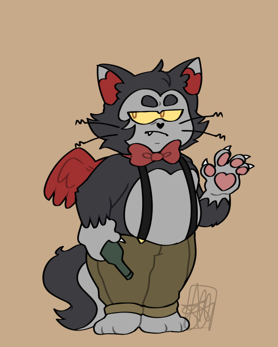
So I decided to draw redesigns for Hazbin Hotel characters! I'm starting off with Husk because to me he's one of the most detailed characters. For his design, I decided to simplify it, because holy hell, Husk has way too much detail- it's insane.
I made his fur slightly darker because according to Viv, Husk is black (or at least implied), but you wouldn't fucking know that because she's terrible at representing certain groups of people. I was originally going to remove the wings entirely, but if I did, he would totally look like a furry OC, so I kept the wings, except I took away all the details and made them small. Basically his wings are for decoration.
I also made him look more like a grumpy old cat (because again, according to Viv, Husk is supposed to be in his 60's or 70's.) And finally I made him chubby because its supposed to represent a beer gut lmao-


#let me know what you think#i want to hear your thoughts#///#by neko loogi#do not repost#loogi's art💚#enjoy my garbage#my art#anti vivziepop#vivziepop critical#hazbin hotel criticism#hazbin hotel critical#hazbin hotel critique#spindlehorse criticism#spindlehorse critical#hazbin redesign
209 notes
·
View notes
Text
Okay this video is about 6 minutes, (all of it is for good reason) but I need to say that every time I look at Viv’s art from today and how she clearly hasn’t improved, I just think back to how she responded to a fan mentioning anatomy in a late 2018 livestream back when she was working on the Hazbin poster:
She goes on to explain how she knows her art has flaws and that she’s not an expert at anatomy, but that she does know basic anatomy and only doesn’t use it because it’s an “aesthetic” style and thinks using it makes her character poses and all look boring so it drives her crazy when people bring it up. I show this because the problem with Viv is not that she’s not an expert at anatomy or wants her characters to look more appealing, but because you just clearly tell from 2018 to now, she clearly hasn’t changed or put in any effort to improve her art. Just because you want your art to not look stiff and boring, doesn’t mean you can’t experiment and actually do research to try to work to be better, which is something she hasn’t done. It’s funny because she’s said that characters like Vaggie’s anatomy is unrealistic but that’s literally ALL her characters because they’re all fucking sticks. Also apparently she doesn’t know that your art can still look good and have pushed expressions and movements WHILE also being consistent right??? The thing that just bugs me is that she acknowledges she knows her art is unrealistic and not perfect but it’s as if she uses that as an excuse to not improve upon it. When it comes to me personally, I’m not asking Viv to be god and have 100% realistic shapes and everything because no one is perfect, but I am asking her to actually branch out her character shapes as well as doing research to TRY to improve because her art has done nothing but downgrade. I feel the reason why her art looks the way it does today is probably because she still has this refusal to listen mindset I’m sorry, but that’s just me.
#also you can tell she’s clearly pissed and that it bugs her when people critique her art#I legit hate her attitude in this video I’m sorry#cause in my eyes she’s clearly trying to reject anyone pointing out her flaws and just downplaying it by admitting those flaws herself but-#not actually improving#I love how she says Vaggie has no anatomy and I’m like…yeah because you didn’t give her any LOL#vivziepop critical#spindlehorse critical#hazbin hotel critical#hazbin hotel criticism#character design talk#character design#vivziepop art critique
82 notes
·
View notes
Text


are people still making hazbin hotel redesigns or
(transcript for the text under the cut)
Charlie: The crown princess and current ruling figurehead of hell. Usually sweet and sunny, if a bit demanding because of her spoiled upbringing. Has a fiery temper that's prone to flare-ups.
Alastor: Enigmatic radio personality and former overlord who disappeared for several years after being ousted from power by Vox. Charming, blackmailing, and murdering his way back up the hierarchy of hell.
Angel Dust: Burlesque performer, drag artist, and pin-up model who also offers 'adult' services to high-profile clients. Sultry, charismatic, always putting on an act. Has a troubled relationship with his manager, Valentino.
Husker: Once a highly successful businessman in Hell who managed Overlords' funds. Now a washed-up alcoholic bartender laying low in the hotel, dodging vengeful loan sharks and Overlords from his shady past.
#obligatory disclaimer i don't support vivziepop or amazon#doing this mostly for fun + critique purposes#hazbin hotel#hazbin hotel redesign#charlie morningstar#alastor#angel dust#husk#hellaverse#my art#wearing a big t shirt that says ASK ME ABOUT MY HH REWRITE
98 notes
·
View notes
Text
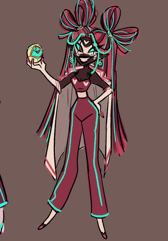
Working on a redesign of Velvette! I like how she acts in the show but I can’t stand her ashy grey skin, so I’m trying to do her some justice! I will also be cooking up some redesigns of the seraphim sisters.
I wanted to make her feel like she takes after both Valentino and vox.
I gave her white smudged make up on the form of a mask because it not only looks cool but I was trying to make her feel like a clown or doll? That’s what her past look resembled I’m not quite sure what she’s based off of or what kind of demon she is, I’d like to think she was a past model/ fashion designer who was very cut throat, bossy and very competitive, she seems very sure of herself, ambitious and opportunistic.
Maybe that lead her to some how falling of her high horse in fashion by a rival? Which resulted in her being called a hack or clown in which she retaliates by snapping on them killing her rival, career and self all in the same day.
#hazbin hotel#artists on tumblr#hazbin hotel redesign#hazbin hotel fandom#hazbin art#hazbin hotel fanart#hazbin critical#hazbin hotel critical#hazbin hotel critique#hazbin redesign#hazbin fanart#fanart#hazbin velvette#hazbin hotel velvette#hazbin hotel vees#vivziepop critical#velvette fanart#art#digital art#sketch art#sketch#artwork#digital artist#fandom art#ghostygray
2K notes
·
View notes
Text

He should’ve been the villain and not a woobified annoying whiny mess 😭 I loved him at the beginning of the show and it slowly turned into pure hate towards him, he’s actually so grating to listen to in the new episodes

#myart#Vivziepop critical#Helluva boss critical#Helluva boss#Hazbin Hotel critical#Vivziepop#redesign#character redesign#character design#bird#design#furry#furry art#art#artwork#procreate#artists on tumblr#Hazbin Hotel#stolas goetia#Fanart#design critique#owl#stolas#Helluva boss stolas#goetia
178 notes
·
View notes
Text


I searched the entire Internet for ideas of Stella's demonic form... I only like the naked skull of a bird, I didn't want to draw lots and lots of eyes like vivzipop, because I was already tired of seeing it in every character.
#helluva boss#helluva boss fanart#helluva boss stella goetia#stella goetia#stella helluva boss art#stella helluva boss fanart#art#helluva boss vivziepop#hb stella#vivziepop criticism#vivziepop critique#vivziepop critical#anti helluva boss#anti vivziepop#stella helluva boss#hb stella art#hb headcanon#headcannons#headcanon helluva boss
214 notes
·
View notes
Text
The Designs for the Main Cast Makes me Wanna Fucking Cry
Okay I'm going to propose a scenario that's relevant to this post. Say you're someone who has NEVER seen or heard anything related to Hazbin Hotel, then I come up to you and show you this picture of some characters from the show.

I ask if they are the main cast of the show and you reply probably. Well TOO BAD FUCK YOU ONLY TWO OF THE MAIN CAST ARE HERE! Now THIS is what the main cast is compiled of.

As someone who likes to do character designs, I take GREAT issue with how their all designed.
And I'm sure I'm not saying anything new as I'm sure everyone and their mother had brought it up, that the excessive use of red in this palette is just NOT GOOD! It makes everything blend together in a bad way and no real distinction between the characters and the background.
Speaking of the characters! Let's talk about those deisgns!
Vivziepop, I have to ask... Why does all the main characters has to have red in their design? Even to those where red is NOT their color? *CoughVaggieCough* It makes them all look the same color scheme wise and tells very little about themselves.
A personal rule I have when it comes to designing characters, one that I'm not sure if many people know, is that the main characters should have their own unique colors and combinations of them to help them stand out more AND get their character across.
The ONLY one in this main cast that DOESN'T have some form of red in their design is Angel Dust, so that makes him stand out more and would probably trick people into thinking HE'S meant to be the main character... when it's actually Charlie.
Which again doesn't help that almost every character in the show have some shade of red in their design so it doesn't help distinguish who's meant to be important or not.
Vivziepop, you have a world where people from different eras of time are all living together, why do you NOT take advantage of this fact to give everyone respective designs to make them stand out more? Why are a majority of the male characters just wearing suits and tuxedos? Hell I've seen people redesign your characters that makes them look better!
(Credit goes to the artists that made these awesome designs)


Just... USE THESE AS INSPIRATION TO MAKE YOUR CANON DESIGNS BETTER PLEASE!!
And if you guys want, I'll be more than happy to come up with my own redesigns on how I would draw the main cast.
#hazbin hotel#hazbin hotel critical#hazbin hotel criticism#hazbin hotel critique#hazbin hotel design#vivziepop critical#vivziepop criticism#vivziepop critique#art related#artist talk
87 notes
·
View notes
Text
Oh my, what a golly SINSmas, am I right?
< tw: blood / gore underneath the cut, wip drawing >

I'm telling y'all that I'm not going to do this for a long time, since I really wasted too much time on this lol
#art wip#stolitz hater#anti stolitz#stolitz critical#helluva critique#anti helluva boss#helluva boss critical#helluva boss criticism#helluva boss critique#helluva critical#anti vivziepop#fuck vivziepop#vivziepop critical#vivziepop criticism#fuck stolas#anti stolas#stolas critical#tw gore#cw murder#artists on tumblr#digital artist#my own art
57 notes
·
View notes